Brightside Health
Native App case study
Turning complex care into a simple, supportive app experience.

My role
Lead Product Designer
Team
Member & Growth Team
For
Brightside Health
Year
2023-2024

Bringing Mental Health Care to Your Pocket
Brightside Health provides therapy, psychiatry, and medication for anxiety, depression, and related conditions. While the web experience was already supporting thousands, members increasingly needed care that fit into their daily lives. We set out to design and launch Brightside’s first native iOS and Android app—bringing personalized, proactive mental health care to users anytime, anywhere.

Our objectives
-
Reduce drop-off by creating a seamless mobile onboarding flow.
Now, we're focused on growing adoption—by meeting members where they are, improving access through mobile-first features, and improving the experience to create seamless pathways from web to app for better engagement and outcomes. -
Our iOS app has been averaging a 4.7 star rating and our Android app in its earliest days has been averaging a 4.5 star rating. This is significantly improved compared to the feedback we’ve historically received regarding our web app experience.
-
We empowered members to stay connected to their care team anytime, anywhere—through secure messaging, CBT-based therapy lessons, progress tracking, and plan management. By making key features mobile-first, we enabled consistent engagement, supported acute needs with timely care, and delivered a more responsive mental health experience on the go.
-
After launch, support tickets around our services dropped by 60%. Bounce rates on the pricing page went from 45% to 22%. Revenue per visitor increased by 12% with zero added marketing spend.
We set out to design a native app experience that makes mental health care feel more accessible, personal, and human.
From booking a session to checking in with symptoms, the Brightside app empowers members to engage with their treatment on their own terms.
As the lead product designer on Brightside’s first native app, I helped bring personalized mental health care directly to users’ fingertips. From early research to launch, I led the end to end product flow and UI design process—shaping an experience that empowers people to engage with therapy, medication, and support on their own terms.
This case study shares how we turned a complex care model into a simple, human-centered app that’s now used by the majority of Brightside members.
-
Leading design workshops and stakeholder reviews
Creating user flows, wireframes, and high-fidelity UIConducting user interviews and usability testing
Partnering closely with product, engineering, and content
Designing with accessibility and user needs and goals in mind
Supporting QA and post-launch improvements through data insights & user behaviour
Our process
Rooted in collaboration , designed for impact.
Our product development process was
fast-moving, collaborative, and deeply informed by data and user needs.
We held monthly whiteboarding sessions, design workshops, and cross-functional check-ins—bringing together engineers,
PMs, data analysts, and product leads to
align on what mattered most.
From early concepts to polished features, every step was shaped by real member feedback and guided by our core values of trust, simplicity, and care. The result?
A mobile experience designed not just to function—but to truly support.
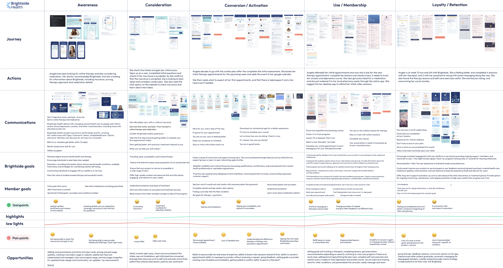
On the left: User journey map
We’ve used design thinking to reach our goals, and our process was always-evolving, and iterative.
This approach involved continuous improvements and user-centered design principles.
1.Empathize: competitor analysis, research, and market placement
Add your pricing strategy. Be sure to include important details like value, length of service, and why it’s unique.
4. Prototype—Start to Create Solutions
Add your pricing strategy. Be sure to include important details like value, length of service, and why it’s unique.
2. Define: State our users' needs and problems
Add your pricing strategy. Be sure to include important details like value, length of service, and why it’s unique.
5. Test and try your solutions out. Keep iterating on it and learning from feedback
Add your pricing strategy. Be sure to include important details like value, length of service, and why it’s unique.
3. Ideate: Challenging assumptions and create ideas
Add your pricing strategy. Be sure to include important details like value, length of service, and why it’s unique.
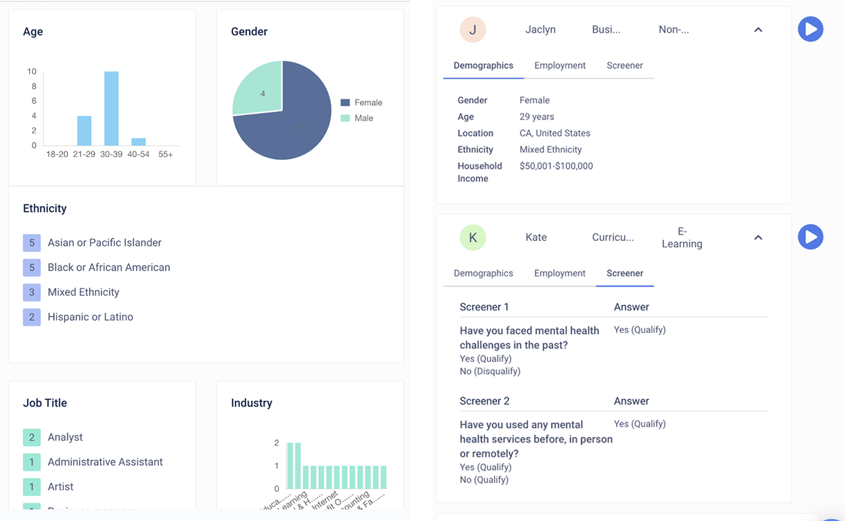
Discovery Research
We started by interviewing prospective members (who are interested in getting mental health treatment, or tried psychiatry/therapy before) and reviewing customer support tickets, NPS results and member feedback to understand what users needed most.
Key themes emerged:
• Members wanted easier access to appointments and progress tracking
• Mobile access was a frequent request
• There was confusion around where to find key care information
• Members had a hard time canceling or rescheduling their appointments.
• Members need more context around checkins, and understanding results of their anxiety and depression checkins.
• Members needed more clarity understanding their progress and how therapy lessons and self care exercises could help them achieve their goals.
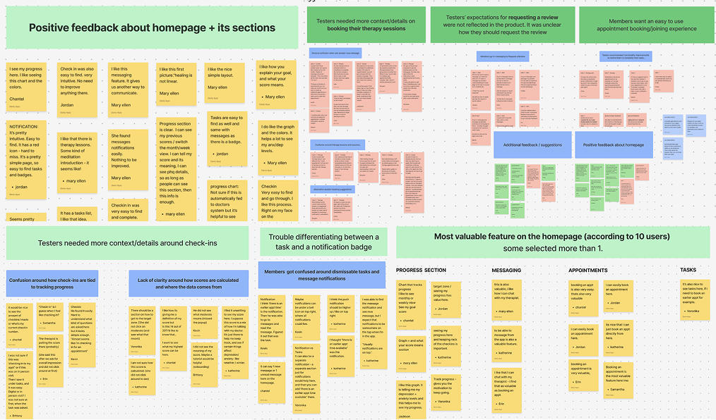
Usability Testing
We conducted two rounds of testing:
Round 1: Tested the core navigation and tracking features
Goal of this test was to establish a navigation architecture for our Brightside native app following the initial beta release. To do so, we must decide on our navigation categories, information architecture, and layout/functionality.
Round 2: Focused on clinical messaging, and how users set their mental health goals & engage with therapy lessons.
Goal of this test was to define the most important actions that users want to take on our app.
Insights led us to refine the onboarding experience, improving messaging and appointment booking features, and prioritize the video and messaging features.
The feedback from these tests and member insights directly shaped the app’s architecture, onboarding flow, and progress tracking tools.
Entering The Design Phase
Entering The Design Phase

We explored navigation patterns that made key actions (progress tracking, check-ins, messaging, therapy lessons) feel intuitive.
I sketched, prototyped, and tested early flows with our team and stakeholders to make sure we were aligned on user goals and business outcomes.
Click on the prototype on the left to see the first draft of my designs.
Visual Design & Content Collaboration
Once the UX was locked in, I led the visual design phase—balancing Brightside’s brand with mobile-first usability.
I collaborated closely with our copywriting & marketing team to ensure that our brand messaging was empathetic, clear, and supportive.
Together, we designed key features like:
• 1:1 video session scheduling and access
• Proactive progress tracking
• Messaging between sessions
• Personalized skill-building therapy lessons and self-care exercises
• Ability to switch provider
• Ability to switch plans & payment method (insurance vs cash)